Bigger product photos in comparisons, and no more phantom scroll arrows
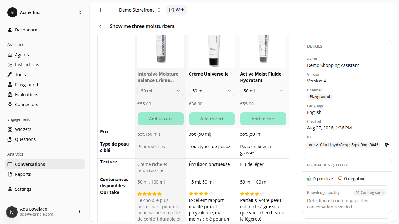
FixedThe assistant's side-by-side comparison used to be a fixed width, whatever the panel around it. Comparing two products left a band of empty space on the right while each photo stayed a small square. The table now fills the panel and the product columns share the room, so the photos are clearly larger with two products, and a bit larger with three. The assistant also loads a higher-resolution image for the bigger frame, so the photo stays sharp rather than soft, and the frame has a ceiling so it can't grow tall enough to push the comparison rows off the screen. With four products the photos are a little smaller than before: the columns had to narrow so that three products fit without a scrollbar, and the attribute column on the left gained room to spell its labels out instead of breaking them mid-word. A four-product comparison scrolls sideways either way.
Three products used to sit a couple of pixels wider than the panel. Invisible to a shopper, but enough to switch on the previous/next arrows and the edge fades, with one arrow landing on top of an "Add to cart" button, to scroll a distance nobody could see. Three products now fit with room to spare, so no arrows appear. Four products still scroll sideways, arrows and fades working as before.
Nothing to install or change on your side.
Resources