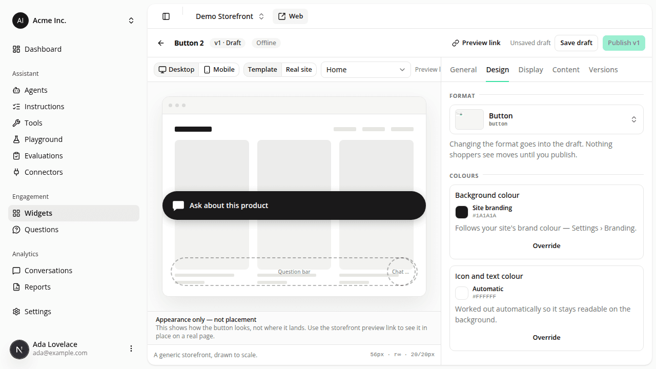
Put a chat button inside your own pages
AddedEvery engagement widget so far has been floating: docked to a corner of the viewport, wherever the shopper scrolls. The new Button is the first one that lives inside your own page: beside the add-to-cart, under the delivery block, in the size-chart drawer. It opens the same conversation, and it can carry a first message written for that context, so a shopper asking about a specific product does not have to explain which one.
Telling us where it goes
There are three ways, and they are not equivalent. They are ranked, and the editor shows the ranking with the reasons beside each one at the moment you choose.
1. Our element in your template (recommended). You add one line where the button belongs:
<iadvize-widget data-iadvize-slot="product-cta"></iadvize-widget>It wins on three counts. There is no window in which we might not find it: the browser hands it to us the moment it exists, whether that is at page load or after a variant switch re-renders the block. It survives a theme change, because the spot lives in your template rather than in a class name that styling work can rename. And you can reserve its space, which is the only way to get the button with no layout shift at all:
iadvize-widget[data-iadvize-slot='product-cta'] {
  display: block;
  min-height: 56px;
}
display: block is not optional there: an element the browser has never heard of is laid out inline and has no box of its own, so a min-height on its own does nothing. Match the height to the widget's Size and nothing on the page moves when the button lands.
2. Your element, marked for us: the same data-iadvize-slot attribute on an element you already have. Keeps the last two advantages, loses the first.
3. A CSS selector you configure here: what the editor starts you on, because it is the only one that needs nothing from your codebase. Name an element, pick where the button goes relative to it, publish. Its two costs, stated plainly:
- Content below the button moves down when it appears: measured on our own test page, 72 pixels of shift.
- A theme change can rename your target, and the button then silently stops appearing.
Mode 3 exists because "add one line to the template" is often not a thing you can do this afternoon: it goes through an integrator, an internal team, or an agency. Ship with the selector today, and move to mode 1 or 2 when whoever owns that template can help. The widget's configuration carries over, and the button keeps working throughout.
Whichever mode you pick, every matching element gets a button, not just the first. Storefront themes routinely ship the same block twice (one for desktop, one for mobile, one of them hidden), and placing the button in only the first copy would make it vanish on the other. It also means a broad selector places several, which is why the editor reports how many matches it found.
What else is new
- The editor checks your mount point. Open the live preview and it reports whether your target was found, not found, or found more than once, on the page you previewed, at the moment you previewed it. It never blocks publishing: your integrator may well place the element after you configure the widget, and that order of work is the whole point of the selector mode.
- A required label. A circle in the corner reads as "chat" with no text. A control sitting among your own buttons does not, so the button's label is required in at least one language.
- Specific page types only. A button's position exists on the pages that have it, so "every page" is not offered for this format. Pick the page types where its mount point is real.
- Your page's font, no request. The label inherits the font from wherever you mounted it. There is no font field and we fetch no font file.
- Styling. The button reuses the launcher's published
::partnames and custom properties, so every rule you already wrote for the chat bubble applies unchanged. Its host isiadvize-widgetin mode 1 and[data-iadvize-widget-host]in modes 2 and 3.
One thing to know about the tag
The assistant bundle's published ceiling moves from 7 KB to 9 KB gzip, and it now measures 8 246 B. The inline button needed three ways of finding its spot, a bounded watch for a spot that has not rendered yet, and a per-widget visibility signal; a trim came first and returned 119 bytes, and the capability cost the rest. The tag performance page carries the full figures, including the new per-mode layout-shift commitment: zero for a floating widget and for an inline one in a mount point you reserve.
One extra request also appears, once per browser tab session, the first time a widget of yours is actually seen: a single beacon recording which of your widgets became visible. Every widget on the page shares that one request, so the figure does not grow with how many you configure, and a widget that stays below the fold sends nothing.
Resources