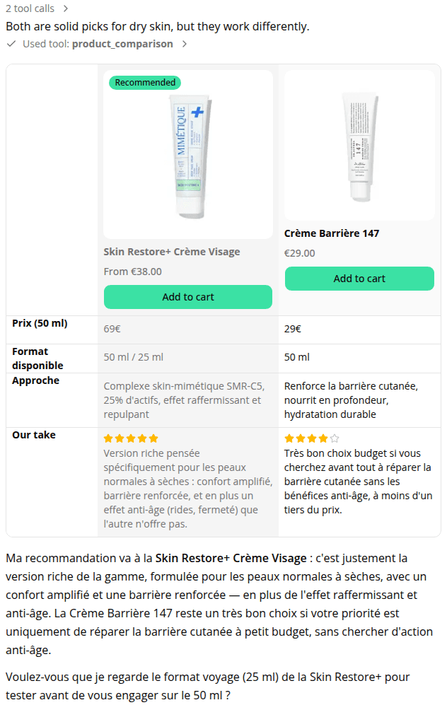
Product comparison table now matches your brand styling
FixedThe assistant's side-by-side product comparison table had four visual bugs, all fixed now.
The Recommended badge sat in its own row above each product's image, which pushed the two products' images out of alignment. It now overlays the top of the image instead, so both images line up.
The Add to cart button under each product was a plain outlined button; it now uses your brand color, matching the button already used in the product carousel.
The recommended product's highlighted column used a fixed tint. It now uses your site's own secondary brand color when you've set one (falling back to a neutral gray if you haven't), and the text inside that column switches color as needed to stay readable against it.
Product titles and prices in the table now render with the same styling as the product carousel, instead of a slightly different look.