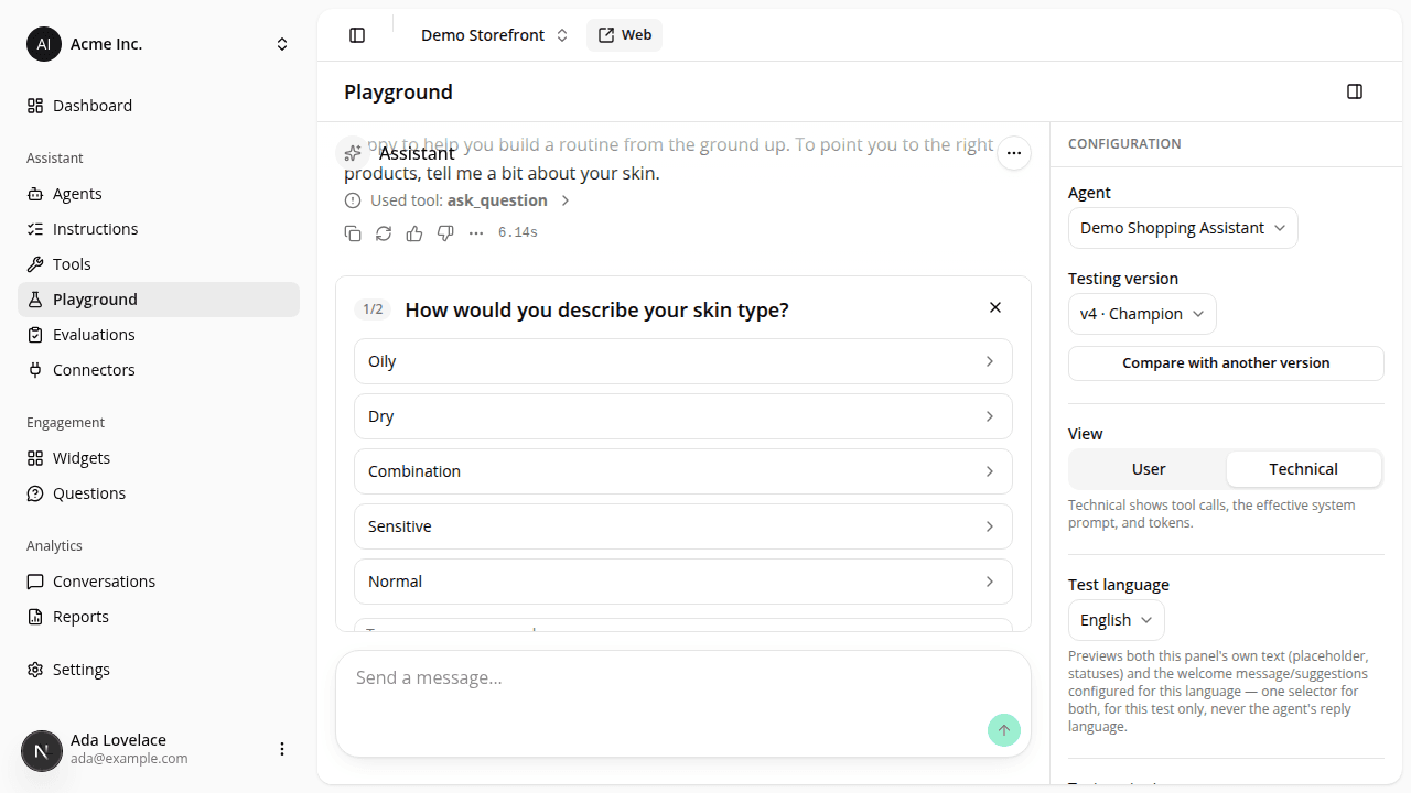
A clarifying question with many choices no longer hides the reply's feedback buttons
FixedWhen the assistant asks a clarifying question ("What category are you shopping for?" with a row of choice buttons), that card sits right above the composer. It had no height limit, so a reply with several choices could grow the card tall enough to push the feedback buttons ("Good response" / "Bad response") on the message that triggered it behind the page's sticky header. There was no scroll position that showed both, so a shopper (or a merchant testing in the playground) could not rate that reply at all.
The card is now capped at 45% of the viewport height and scrolls internally when there are more choices than fit. The question itself, and its close button, stay pinned to the top of that scroll area, so they're always visible while the shopper scrolls through the choices below. Nothing to change on your side.
Resources