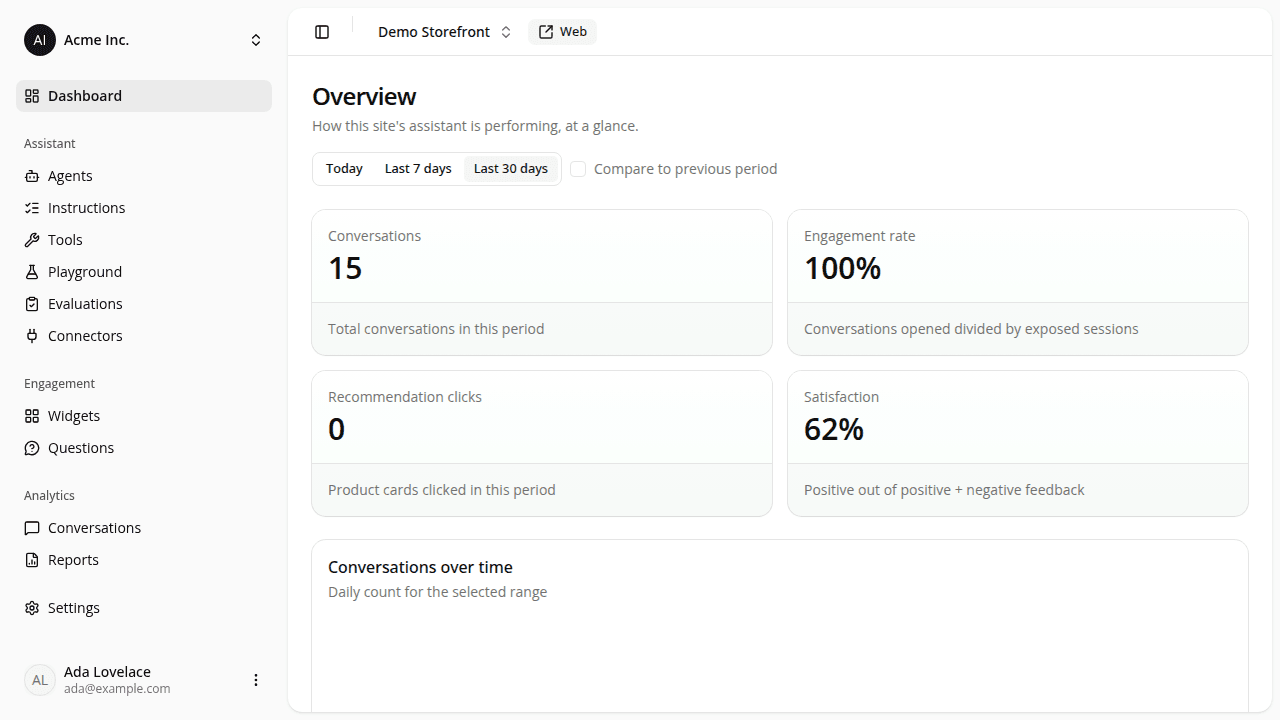
A real overview on your site's home page
ChangedOpening a site used to land you on sample data: a demo revenue chart and a customer table that had nothing to do with your assistant. That page is gone.
The site's home page now shows what your assistant actually did:
- Four KPI tiles (Conversations, Engagement rate, Recommendation clicks, Satisfaction) for the period you pick.
- A conversation-volume chart, current period against the previous one when you turn on comparison.
- Three breakdowns: by agent, by tool usage, by language.
- A recent conversations panel with the 5 latest conversations, always up to date regardless of the period you're viewing.
Each tile and chart links straight to the full report it summarizes (Conversations, Engagement, or Quality), so the overview is a starting point, not a dead end.
The date range on this page is a simple Today / Last 7 days / Last 30 days switch (30 days by default) plus a compare-to-previous-period checkbox, lighter than the calendar picker on the Reports pages, and remembered separately from them. If you need a custom range, go to Reports.
Engagement rate and Satisfaction show "No data yet" instead of a misleading 0% when there's nothing to measure yet: no widget traffic for the first, no feedback for the second. A genuine 0% (real traffic with zero opens, or all-negative feedback) still shows as 0%.
Resources