Product comparison columns now line up, with arrows to scroll
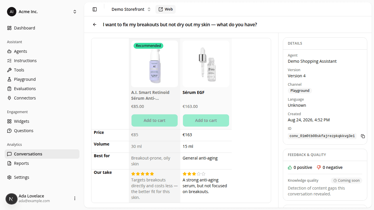
FixedIn the assistant's side-by-side comparison, each product's column was laid out on its own, so a longer title, a variant picker on one product but not another, or a discounted price pushed everything below it out of step. Images ended at different heights and the "Add to cart" buttons sat on different lines. Every element now shares a line across all compared products: images, titles, variant pickers, prices and buttons.
When the assistant compares more products than fit the panel width, previous/next arrows now appear, along with a fade at the edge that shows there's more to see. Each arrow disappears once you reach that end of the comparison. Before, the comparison only scrolled with a touch swipe and nothing on screen said so. On a desktop it looked like the extra products simply weren't there.
When you scroll sideways, the "Recommended" badge now slides behind the attribute names down the left instead of over them. A variant name too long for its picker is now shortened with an ellipsis instead of being cut mid-word. Nothing to change on your side.
Resources