Restyle the launcher and question bar from the dashboard
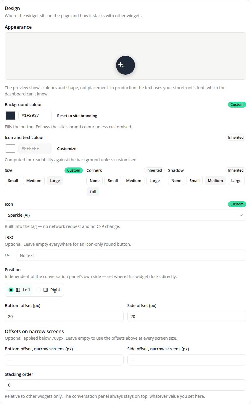
AddedEngagement widgets used to be configurable for where they sit and nothing else: every colour, dimension, and the launcher's glyph were fixed in the tag. The Design card on a widget's page now opens with an Appearance section that changes all of it, for both the launcher and the question bar:
- Background colour and Icon and text colour.
- Size (48 / 56 / 64px), Corners (from square to fully rounded), and Shadow (from none to pronounced).
- For a launcher: an Icon from a built-in catalogue (chat bubble, message, sparkle, question mark, advisor) and an optional Text label, translatable per language, which turns the round button into a pill.
A live preview sits above the fields and updates as you change them. It's driven by the same code the storefront uses, so it can't show you a colour or a shape your shoppers wouldn't get.
Everything inherits your site's branding by default. Leave a field alone and it follows Site → Settings → Branding, so changing your brand colour still updates every widget at once with nothing to re-save. Overriding is per widget, marked with a Custom badge, and reversible with Reset to site branding. If a colour pair you pick falls below the 3:1 contrast recommended for interface elements, the editor warns you and shows the measured ratio. It never blocks the save.
Your launcher's colours change with this release
The launcher used to render as a white bubble with the glyph tinted in your brand colour. It now renders the other way round: the button is painted in your brand colour, with the glyph in black or white, whichever reads better on it. That matches what every comparable product does and what merchants expect, but if your launcher is already live on a storefront, it will look different after this ships. Nothing to do if you're happy with it; if you're not, set Background colour and Icon and text colour explicitly on the widget. Size, corner radius, shadow, and the glyph itself are unchanged. On the question bar, only the send arrow may shift: it now flips to black on a light brand colour instead of staying white.
Also in this release: optional separate offsets below 768px. A widget can now sit at different distances from the edges on narrow screens than on wide ones, the case being a storefront with a mobile-only fixed bar (a sticky add-to-cart, a cookie banner) that the widget would otherwise cover. Leave the narrow fields empty and the widget keeps using its usual offsets at every screen size, exactly as before.
If the fields don't go far enough, both widgets now expose a small, documented set of CSS custom properties and shadow parts you can target from your own stylesheet, with no extra Content Security Policy directive. See Style engagement widgets with CSS.
Resources