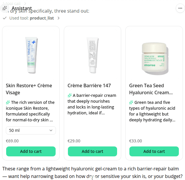
Bigger carousel arrows and a clearer product card layout
ChangedTwo changes to the product carousel the assistant shows shoppers:
- The prev/next arrows are bigger, so they're easier to tap, especially on touch devices.
- Each card now reads in a clearer order: the product title stands out first, then the assistant's pitch on why this product fits (marked with a small icon), and the price last, de-emphasized now that the pitch is the main sell.
Resources