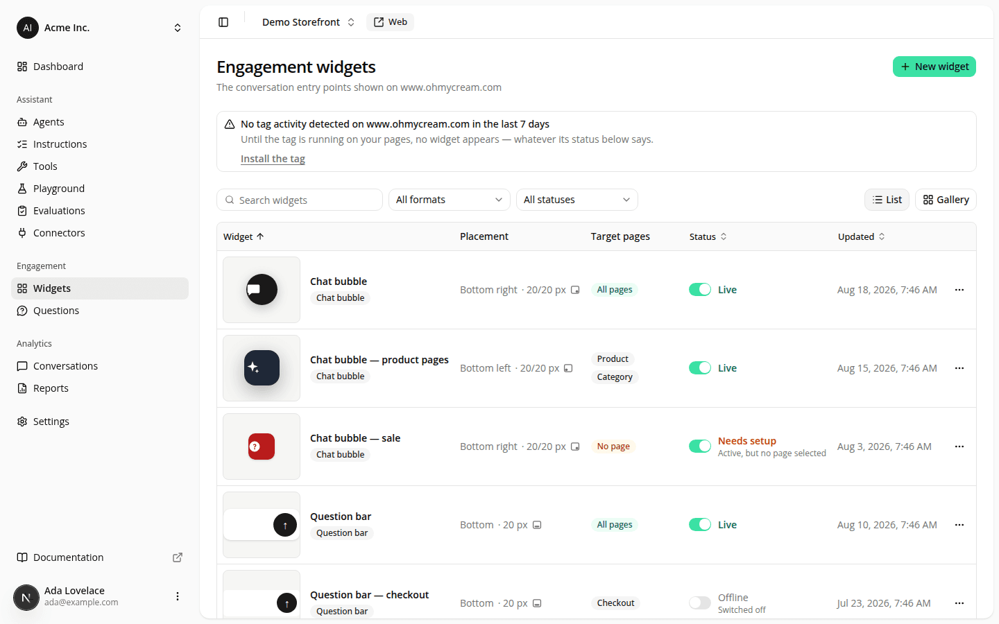
Engagement widgets now have names, an honest status, and a list you can search
ChangedThe engagement widgets page is the one you open when something isn't showing on your site, and it could not answer that question. Every widget of the same format showed the same badge above an optional description most people left empty, so a site with five widgets read as five identical rows. Worse, it told you things that weren't true.
Widgets have a name now, and it's required. The optional Description is gone; Name replaces it, up to 80 characters. Anything you had written in a description became that widget's name, so nothing was lost. Widgets with an empty description were named after their format, in English. Rename those. A widget created from the format catalog arrives named "Chat bubble" (then "Chat bubble 2" if that one is taken) with the field ready to be replaced, so one-click creation stays one click.
Status tells the truth, in three values instead of two. A widget that was active but had no page type selected renders nowhere (the tag never serves it), and the list still called it "Enabled". It now reads Needs setup, with the reason next to it. The three values are Live (active and targeted, shoppers see it), Needs setup (active, but targeting no page), and Offline (switched off). The switch is what you control; the label is what your visitors actually get.
A warning when your tag isn't running. If no tag activity has been recorded for your site in the last 7 days, a notice now sits above the list: until the tag is live on your pages, no widget appears to anyone, whatever its status says. It reports what we've seen, not what's installed: a brand-new site with no visitors yet shows the same notice.
Search, filters, sorting, and a second view. Search by name (accents and case don't matter), filter by format or status, sort by name, status or last change. Your filters and your chosen view live in the page's address, so a filtered list survives a refresh and can be shared. List shows every column; Gallery shows each widget as a card standing on a neutral page, in the corner or along the edge it docks to. On a phone the gallery is the only view. Six columns don't fit on a narrow screen, so the switch is hidden and a list link shared from a desktop opens as a gallery there, then reads as a list again on a wide screen.
More you can do without opening a widget. Each row shows the widget's real appearance as a thumbnail, where it sits, which pages it targets, and when it last changed. The last-changed date replaced the creation date, which nobody was reading. Flip the switch on a row to put a widget online or offline; taking a Live one offline asks you to confirm, because shoppers stop seeing it immediately. The ··· menu now offers Edit (it was "View", but the page it opens is an editor), Duplicate, online/offline, and Delete.
Duplicate copies a widget's look, placement and targeting into a new one that starts offline: the quick way to make a variant without re-entering a dozen fields. Whatever the original inherits from your site's branding stays inherited in the copy, so a rebrand still reaches both.
And a warning when two widgets would collide. When two Live widgets share a region and can appear on the same page, a line above the list names both of them. It's a warning, not a rule: nothing is blocked, and widgets deliberately stacked at different offsets aren't flagged.
One thing this doesn't do yet: tell you which widget performs best. That needs per-widget measurement, which isn't built.
Dashboard-only for what you see. Under the hood, a widget's format field was renamed from type to format in the site config the tag fetches; the values (launcher, composer) and everything your own CSS and JavaScript touch are unchanged.
Resources