Trend charts now show a value scale, and the site home page's cards are no longer links
ChangedFour changes to how the reporting screens read, plus one convenience we took away.
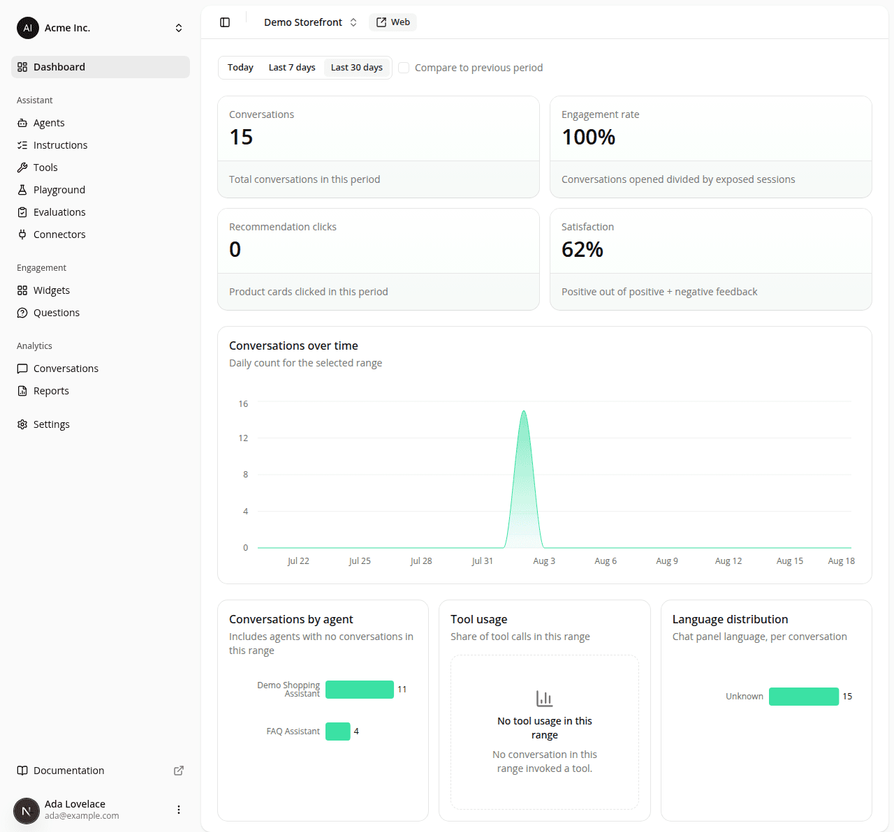
Trend charts have a scale. The volume charts only labelled the days along the bottom: nothing on the chart told you whether a peak was 5 conversations or 500, so you had to hover a point to find out. They now have a value axis down the left, with whole-number ticks. This covers the conversation-volume chart on a site's home page and on the Conversations report, the exposure/opens chart on the Engagement report, and the feedback chart on the Quality report.
The curves were also drawn with a spline that overshot between points: on a day where the count dropped to zero, the curve swung below the baseline and painted over the day labels underneath. Curves now bend without overshooting, and the scale is pinned to start at zero, so a series that touches zero sits on the baseline instead of dipping through it.
A breakdown with one category looks like a bar again. The ranked breakdowns (by agent, tool usage and language on the home page and the Conversations report, impressions & clicks there too, negatives by category and satisfaction by agent on the Quality report) sized each bar to fill the height they were given. With a single category that produced one thick block spanning the whole card. Bar thickness is now capped, so a sparse breakdown reads as a bar. Charts with four or more categories are unchanged.
The site home page's cards are no longer clickable shortcuts into the reports. Every card on a site's home page used to be a link to the report it summarizes. That's removed: a convenience gone, not an improvement. The reason: making the whole card a link is what caused two visible defects, a hover highlight painted around an area taller than the card itself and cards in a row that never ended at the same height, and it also trapped the charts and their tooltips inside a link. The Reports entry in the sidebar is now the way to the full reports. The recent conversations card keeps both of its ways in: its View all conversations link and each conversation row still open what they always did.
The recent conversations card names its columns. The five most recent conversations were listed as a title, a row of bare badges and a date, with nothing saying what any of it was: a "2" next to "Web" could have meant anything. The card is now a table with a header row: Title, Agent, Channel, Messages, Feedback, Created, the same labels the full Conversations table uses, so the two name the same things. Clicking a row still opens that conversation, and a title too long for the column shows in full when you hover it. Sorting and paging aren't here: this card is still the five most recent, and the Conversations page is where you sort and filter. A site with no conversations yet shows the same empty state as before, with no table and no header row.
The home page no longer prints a title and a description. The site's name is already in the header's site switcher and the page is already marked in the sidebar, so the heading and its one-line restatement were spending space for nothing. The range toggle, the KPI tiles and the chart now start that much higher. Screen readers still get a heading naming the dashboard and the site, and the browser tab still reads "Dashboard".
Dashboard-only: nothing here changes what shoppers see.
Resources