Engagement widgets keep versions, and their editor is a workshop
ChangedUntil now, saving an engagement widget put it on your storefront. There was no way to work on one for ten minutes without shoppers seeing every intermediate state, and no way back to what it looked like yesterday.
Editing writes a draft. Every configuration change (colours, placement, targeting, text) goes into a draft, and the draft reaches your storefront only when you press Publish. Save draft stores your work and changes nothing your visitors see. The previous live version is archived rather than discarded.
Publish is unavailable while you have unsaved changes, and it says so. Publishing sends what is saved, so allowing it there would put your previous draft live while your unsaved change sat on the screen.
Version history, with restore. The new Versions tab lists every version this widget has had, its status, when it was published or last edited, and who did it. Restore copies an archived version back into your draft. It never publishes, so a restored configuration is yours to look at before anyone else does.
Two things still apply immediately, on purpose. The Active switch and the widget's Name are not part of a version: switching a widget off stops it now, not once you remember to publish. Everything else waits for you.
A fourth status: Never published. A widget nobody has published has nothing to serve, whatever else is configured: a different problem from "no page type selected", with a different fix, so the list and the editor now say which one it is. A row can also carry a discreet Draft waiting marker, because a widget can be perfectly live on one version while newer work sits unpublished.
The format is no longer locked. Picking the wrong card at creation used to mean deleting the widget and starting again. A chat bubble can become a question bar and back, through the same draft, and the editor tells you exactly which settings the new format has no place for before it changes anything. Your translated text carries across both ways.
The edit page
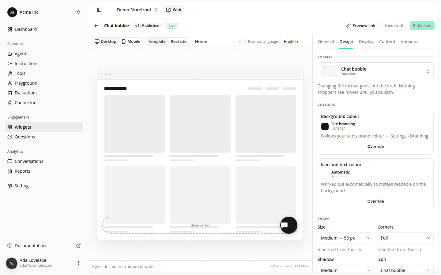
Three stacked cards and a 160-pixel decorative preview became a two-column workshop: the widget standing on a page-sized storefront on the left, five tabs on the right, one action bar across the top.
The preview is real. It draws the widget at the offsets you set, at full scale, from the same code your storefront runs, so an 88-pixel bottom offset looks like 88 pixels instead of being reported as a number beside a picture that ignores it. It also draws your site's other live widgets as dashed outlines and warns when the one you are editing would land on top of one.
A page-type simulator, including the "page type not declared" case: the state of a storefront that never tells us what page a shopper is on, and a common reason a widget appears where nobody expected it. When your targeting excludes the simulated page, the preview says so instead of drawing a widget that would not be there.
Your own storefront behind it. Switch the preview from the wireframe template to Real site and your storefront loads behind the widget, with the tag disabled so you do not see your published widget next to the previewed one. Some sites refuse to be displayed in a frame; when yours does, the preview names the header responsible instead of showing you a blank rectangle.
A preview link. For the cases a dashboard preview cannot settle (does the bubble sit on top of your cookie banner?), Preview link creates a short-lived link that shows the draft on your real storefront with the real tag. Only someone with the link sees it, your shoppers keep getting the published version, it expires after an hour, and you can revoke it at once.
Colours say what they inherit from. An inherited colour used to carry a badge reading "Inherited", which answered the wrong question: looking at a teal bubble, you wanted to know where the teal came from and how to get back to it. Each colour now names its source in plain words, shows the value it resolves to, and labels the way back with the value it returns to. Size, corners and shadow became dropdowns whose options state the real value next to the name (Medium, 56 px) rather than just "Medium".
Existing widgets were carried over unchanged: each one's current configuration became its first published version, so nothing moved on any storefront.
Resources