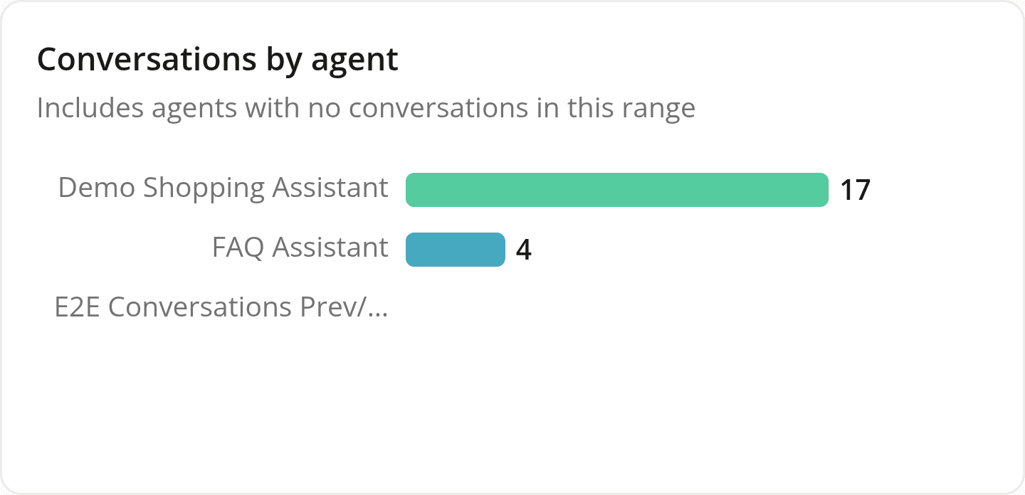
Bar charts now render at a consistent size, with cleaner labels
FixedThe ranked bar charts used across Reports, in "Conversations by agent," "Tool usage," "Chat panel language," "Impressions & clicks," and the Quality report's feedback breakdowns, drew each bar's thickness based on how many categories it had. A chart with only one or two rows ended up with a thick, fully rounded bar that looked like a badge rather than a bar in a chart. Every bar is now the same thickness regardless of category count.
Cards in the same dashboard row now line up: a chart with few rows no longer sits shorter than its neighbors, and a card with no data reserves the same space a populated one would.
Category labels that used to run past the edge of the chart and collide with the bars now truncate with an ellipsis. Hover or focus a truncated label to see the full text.
In the "Tool usage" breakdown, a tool provided by a connector no longer shows a redundant prefix in front of its name. A Shopify-provided tool now shows just its own name instead of shopify · search_catalog.
Resources