A new look for the dashboard: redesigned sidebar, colors, and charts
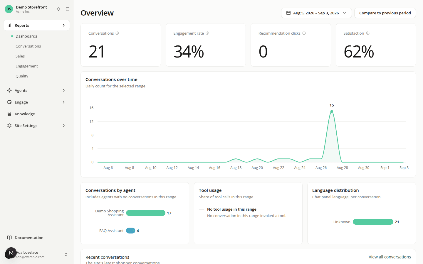
ChangedThe dashboard has a new look, top to bottom: colors, typography, spacing, and (the biggest change) how you navigate it.
A new two-level sidebar replaces the old page tabs. Reports, Agents, Engage, and Knowledge are now sections in the sidebar itself, each unfolding to show its own sub-pages (Reports, for example, opens into Dashboards, Conversations, Sales, Engagement, and Quality). The row of tabs that used to sit at the top of Account, Settings, Site Settings, Reports, and the Agents workspace is gone. That navigation now lives in the sidebar, or, for Account, in a tab strip directly on the page.
The sidebar itself works differently. Collapsed, it's a 64px icon rail; hover it and a full 250px panel expands over the page without shifting your content. On a wide enough screen (1200px and up) you can pin it open with a new toggle next to the site switcher. Below 1200px it behaves as a rail, and below 860px it becomes an off-canvas drawer.
The site switcher moved into the sidebar, and it's now always there. It used to live in a header bar and only appeared while you were inside a site's workspace. It's now at the top of the sidebar, showing your current site's name (searchable, same as before), and it stays visible even on account and organization-settings pages, always showing the site you'll land back in.
Organization switching and settings moved to the user menu. Click your avatar at the bottom of the sidebar to switch organizations, create a new one, or open Organization Settings (General, Members, Roles, API keys, Billing, Audit log), all from one submenu. The same menu's header row now opens straight to your account instead of listing My account/Security/Notifications as separate items; switch between those from the tab strip on the account page itself. Theme (Light/Dark/System) is a small switch right on the menu, not a submenu to hover into anymore.
The global header is gone above 860px. Each page now carries its own title in the content column instead of a shared bar across the top.
Reports, KPI tiles, and charts got a visual overhaul. KPI tiles show a large number with an info tooltip for context instead of a subtitle; charts have a redesigned hover (a single tooltip, a crosshair, one peak marker), dashed lines for period comparisons, and category breakdowns that fold anything past the top few into an "Others" bar. The Agents list also adapts to how many agents a site has: a single full-width card for one agent, a two-column grid for a few, and the existing sortable table once you have several.
Smaller polish: toast notifications now appear bottom-right instead of top-right, buttons no longer flash a loading spinner for near-instant actions, and dark mode has its own tuned palette rather than an inverted light one.
Nothing here changes what a shopper sees: this is all dashboard navigation and styling.
Resources